Sunday, February 6, 2011

Blog Post 4: Commodity, Firmness, and Delight

"In architecture as in all other operative arts, the end must direct the operation.  The end is to build well.  Well-building hath three conditions: Commoditie, Firmness, and Delight.
- Sir Henry Wotten, The Elements of Architecture, 1624

In the past week we have been looking at how commodity, firmness, and delight are accomplished in design.  We then looked at how these three principles related to both architecture in the Roman Empire and today, here on UNCG campus.  These three principles originated from the words utlitas, firmitas, and venustas.
Utlitas: useful arrangement, quality, and interpersonalship of spaces
Firmitas: performance, stability, integration, and safety
Venustas: ability to create a sense of place, a positive effect.


Front Entrance to MHRA

The building on campus that I think shows these three elements the best is the Moore Humanities and Research Administration building (MHRA).  I think that this building fulfills commodity, firmness, and delight.  The front entrance of the building is a circular form made of glass and steal with a concrete shell on the outside of it with double five sets of double doric columns for support.  The materials that make up the front entrance to this building are glass, steel/metal, tile, stone, and concrete.  As for the space just inside of the entrance there is a circle and when someone is standing in the center of that circle or on axis the ambience is much better than it is if you move off center/axis in that circle.  Radiating out from this circle are different colored tiles imbedded inside the larger white tiles that keep you on axis as you move into the space and as they get further into the space they get further apart.  Theres places on the floor are also mimicked through the lighted squares in the ceiling that also carry your eye on axis through the space.  Another thing that leads you through the space is the glass walls that are at the front, in the front office space, and at the back entrance that lead you eye from the front of the space to the back of the space.  The use of the two different colors of tile help to separate the areas where there are classrooms and the areas where the administrative offices are because the stone on the side where the offices are is tan whereas the stone on the classroom side is dark grey.  

View from Front Entrance
Administrative Offices

The frosted glass on the front entrance into the office space serves as a somewhat translucent barrier between the entrance to the building and the lobby of the offices without completely closing them off from one another.  
View of Front Area of Administration Offices

There are several layers of columns at the front entrance to this building.  First there are the cement doric columns at the very front of the building.  Then there are the plain cement columns right up against the glass and steel beams in between the glass that are directly behind them mimicking their form.  Plus, there are even hollow fatter columns on the inside of the building imitating all of the exterior columns.  

When it comes to circles and their corresponding 3D forms as marking sacred spots I think that the circle used in this building does mark a sacred spot.  Aside from it being the entrance into the building it is also the central point between the classroom section of the building and the administrative offices side of the building.  This circle also marks the beginning of the axis expressed in this building with the small colored tiles radiating out from it and leading you into the building.  Not to mention if you stand in the central circle that those small tiles create then your voice carries much better than if you are standing off axis or even on axis but not in that center spot because of the ambience effect of the building.  So for those reasons I do think that the circle in this building marks a sacred spot within this building.

Color Week


All color week assignments 

Color Week Assignment 1: Combination of two colors

Color Week Assignment 2: Combination of two colors

Color Week Assignment 3: Combination of four colors with one color

Color Week Assignment 4: Combination of three colors

Color Week Assignment 5: Color Palate

Color Week Assignment 6: Using colors from color palate abstractly represent the four seasons of the year (spring, summer, fall, winter)

Thursday, February 3, 2011

My Design Manifesto


A manifest is defined as a public declaration of policy and aims.  Living in a country with freedom of speech our manifesto can be about anything such as what we believe, what we value, how we feel about certain things, what we think, and how we choose to live.  All of these things shape the world around us as well as shaping us along the way.  Design is all about learning as you go and shaping the way you see and perceive things in the world around you and how you interpret that in return.  I know in my personal experience since coming into the interior architecture program my view of the world around me has changed a lot just over the course of a little over a semester and I know that it will continue to change as I learn more and I cannot wait!  I think design is really exciting, scary, challenging, and empowering all rolled into to one and I cannot imagine doing anything else.  Before you can succeed in design you have to fail.  As Tommy and Stole told us in the first couple of days in class “you have to learn how to fail before you can learn to succeed.”  It was quite a challenge failing and then having to learn to move on from that failure and turn it into a success.  I’ve come to view design as an adventure, you may come across some bumps in the road or get lost a few times but you get to have a blast along the way as well.  I approach studio in the same way because some days are really challenging and it would be easy to just throw in the towel and give up but I think the fight is worth it and I can’t wait to see where this adventure leads.

“Our job is to give the client…not what he wants, but what he never dreamed he wanted; and when he gets it, he recognizes it as something he wanted all the time.”
-Denys Lasdon quote from Designerly Ways of Knowing


Sunday, January 30, 2011

Social Networking in Bulgaria

Map of Bulgaria
Image from: http://www.state.gov/r/pa/ei/bgn/3236.htm

Bulgaria is a country in Europe bordered by Romania to the north, Turkey and Greece to the south, Serbia and Macedonia to the west, and the Black Sea to the east.  The country occupies 110,910 square kilometers, which is just a little bit bigger than the size of Tennessee.  The population of Bulgaria is around 7,204,687 people and their government is a parliamentary democracy.

Image from: http://www.scottmonty.com/2008/09/social-what.html

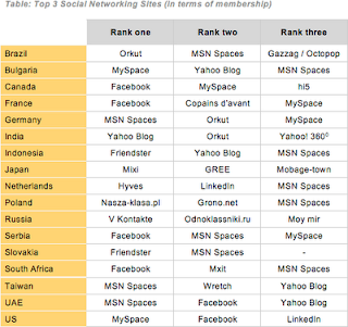
In a survey of 13,000 consumers in Brazil, Bulgaria, Canada, France, Germany, India, Indonesia, Japan, the Netherlands, Poland, Russia, Serbia, Slovakia, South Africa, Taiwan, the UAE, and the United States 58% of them did not even know what social networking is and only 26% are members of a social network. 
One social network that has managed to reach Bulgaria is Facebook.  There are a total of 1,909,560 Facebook users in Bulgaria, which is 26.71% of the population.  The people of Bulgaria also have access to Myspace, Yahoo blogs, MSN spaces, as well as several online dating and marriage sites. 


Banya Bashi Mosque
Image from: http://www.iho-ohi.org/index.php/category/bulgaria/

They are currently trying to find ways for the younger people to use social networks safer than they are at the present time.  This was started due to three recent cases of sexual abuse on minors because pedophiles found their information so easily on the current networking sites.  The people have worked together to convince social network owners to add additional protection measure, especially for users that are under the age of 18.


Bulgarian Flag
Image from: http://www.gotterdammerung.org/bulgaria/symbols/index.html


Information sites:  
http://www.state.gov/r/pa/ei/bgn/3236.htm 
http://www.socialbakers.com/facebook-statistics/bulgaria
http://blogs.sitepoint.com/2008/09/04/social-networking-not-quite-mainstream/
http://www.saferinternet.org/web/guest/blog;jsessionid=E409B6F84B5912653EFEDE1712A34A4A?p_p_id=homeBlog_WAR_insafeportlet&p_p_lifecycle=0&p_p_state=normal&p_p_mode=view&_homeBlog_WAR_insafeportlet_action=detail&_homeBlog_WAR_insafeportlet_articleId=122225&

Blog Post 3: 10 Principle Ideas on UNCG Campus

This week for our blog post we had to take the 10 principle ideas covered in class (space, power, experience, principles, precedent, site, order, scale, technology, and surface) and apply them to things on UNC-Greensboro campus.  Then hypothesize how each of these ideas has been expressed in material form around campus.

Space: When I think of space being used on UNCG campus I think of how the campus is well spread out.  There are the dorms at one end of campus and then most of educational buildings and offices at the other end with the EUC and the Jackson Library right in the center because that is where a lot of people gather.  All of the buildings on campus are spaced out enough so that there is enough space between the buildings for people to get around campus.  There is space for roads for traffic going through campus, sidewalks, and then space for leisurely areas such as parks and sitting areas scattered around campus.  Also due to the increasing number of students coming to this university the campus is being expanded to take up even more space to accommodate for all the new students.
Campus map
Image from: http://firstcard.uncg.edu/locations.html


Power:  The taller the buildings in the Xianyang palace the more important that meant they were.  So it comes as no surprise that that idea is still used today.  The tallest building on campus is the library tower and it literally towers over the buildings surrounding it.  The library is also the center point on campus and between that and the EUC are at the heart of this school.  Not to mention that with the library's height and bright white exterior it can be really hard to miss and for someone knew could be used to help show them the way.
Jackson Library

Jackson Library Tower


Experience: On a college campus there are tons of experiences and UNCG is no different.  There are the experiences of being away from home for the first time, living in a dorm, having a roommate, setting your own schedule, and so much more.
UNCG Basketball Game
Image from: http://www.uncg.edu/cha/chancellor_report/2009a/athletics.html

Principles:  The majority of the buildings on campus are designed about the same way.  Most of them are  made of simple solid brick exteriors.  Almost none of the buildings on campus have any kind of external decoration with the exception of the gothic style Foust building.  Plus a large portion of the buildings on campus have columns flanking the front entrance with large pediments atop them.
Alumni House

Stone Building

Precedent:  Since most universities are literally a living and learning community all of the parts have to work together to make sure the students needs are met.  At this university there is a pretty distinct area where each of the students needs are met.  There is the EUC and the cafeteria for getting food and socializing then there is the library, academic buildings, and classrooms for soaking up knowledge.  There is also the health center and plenty of outdoor areas to exercise and stay fit.  Last but not least, for the students that live on campus there are the dorms where students can sleep, eat, relax, hang out, study, or anything else they want to do.
Campus map
Image from: http://www.uncg.edu/tlc/contacts/directions.html

Site:  UNC-Greensboro campus is just a short distance from downtown Greensboro.  The campus started out pretty small when it was just a woman's college but now they have had to expand the area that the university sits on quite a lot to accommodate for remodeling buildings and a higher student population.
Original map of UNCG when it was a woman's college
Image from: http://eia.uncg.edu/bio/facilities/peabody%20park/history.html


Order:  On UNC-Greensboro's campus there seems to be a place for everything.  The EUC and the Dining hall are for eating, hanging out, or stocking up on supplies.  Then there is the library for studying your heart out, writing papers, or finding a good book to read for fun if you can find the time.  Then the dorms are for some of all of the above.  With the academic buildings and offices there is even more organization.  Majors are separated into different departments and different departments are in different buildings.  Some of the most specific majors even have a building all or partly to themselves such as nursing, music, interior architecture, and art.  Everything on campus just seems to fit into its own place here at UNCG.

Music Building


Scale:  The campus is here is very spread out and yet it does not take long to get from point A to point B whether you are walking, biking, skateboarding, or driving.  The sidewalks weaving around each of the buildings makes it much easier to get where you are going faster despite the size of the campus.

Technology:  Technology is a big part on college campuses today.  There are computers, ipods, cell phones, tvs, projectors, and so much more that are all being improved upon all the time.  The school is constantly trying to update with the newest and most affordable technology to help students learn. These advancements can also be seen by looking at the buildings from, Foust, the oldest building on campus to the new dorm on Spring Garden Street, which is being built right now.  The older buildings on campus such as the quad and Foust were originally made of solid bricks.  However, now with technological advancements the newer buildings on campus such as the Gatewood Studio Arts building and the new dorm that is currently being built are made mostly of steel and are much more modern looking pieces of architecture.

Surface:  Brick seems to be the primary surface covering around campus.  There are brick walls, brick sidewalks, buildings made of brick, and even college avenue which is composed mostly of bricks.

Reading Response 3

Saturday, January 29, 2011

Light Box Final Model

For this project we had to make a five-sided box (one side open for viewing) out of either corrugated cardboard or foam core.  The exterior of the box could be any color but the interior had to be white.  The overall dimensions of the box had to be 12" x 12" x 18", with one 12" x 12" end left open.

Then using a remote light source, such as a desk lamp, flash light, etc. that shines through a series of openings in the box, creating a pattern of light within the box that divides the space into four parts.

Then for the second portion of this project we had to incorporate bamboo skewers and/or white bristol board into the box to articulate/modulate the planes and accentuate the light and shadows.

For my light box I used foam core that was white on one side and then the other side was white with grey speckles all over it.  For my light source I used a small LED flash light.  For my first model I cut two different sets of triangles on the top side.  One set of triangles were fairly small and then there were too larger triangles opposite each other.
I moved my light source around several times to create different effects but I really like the one that I ended up with.  At first I had the light source pointing straight down through the top to make a patter on the floor of the box.  Then I changed it so that the light shined in from an angle through the front of the box creating a pattern on the floor and back wall of the box.
With incorporating the skewers and the bristol board I originally had the skewers connecting each set of triangles and I tried to incorporate the bristol board but it just made it look too busy.

For my final model I decided to change all four of the triangles to be the same size and I chose the smaller size because the larger size triangles would not have worked the way that I wanted them too.  Then I took the skewers and stuck them straight down through the center of the triangles so that they came out at the point and extended the triangles and showed the direction of the light.  I like the shadow of the X that it makes of the floor of the box and then the light areas on all sides of the X.  If this were an actual space I think it would be a room where something was on display like a museum or a gallery because between the downward pointing triangles on the ceiling, the downward pointing bamboo skewers, and the light and shadow triangles on the floor they all point to the center of the black X on the floor. 
Front View

Interior of box

I also really like how when the light is shining down into my box the front triangle is silhouetted and then the light shines directly on the back triangle to make it really bright.
Interior shot of ceiling cuts

Interior view of cuts in top

Top view