Sunday, February 27, 2011

Reading Response #7: 2/28/11

This past week we have been discussing the "rules" of architecture in both the Eastern and Western world. One of these rules was Rule #3: layer groves and stacks when possible.  Some places from the textbook that fit this rule from the Eastern world are the Medici Palace and the Fucellai Palace, which are both in Florence, Italy.  The Medici Palace was designed by Michelozzo di Bartolomeo Michelozzi but it was influenced by Brunelleschi's principles.  The building followed the previous prototype of the three-story buildings that was established in the 14th century.  The first floor of the building is heavily rusticated to imitate the fortresses built by Emperor Frederick II in the middle of the 13th century.  Each floor of the building has a different amount of external material:

Medici Palace
Image from: http://etc.usf.edu/clipart
/45000/45064/45064_medici.htm
  •   First floor = all of the bulky material is left showing on the facade
  • First floor is separated from the second floor by a piano nobile 
  • Second floor = smoother material is shown by the lines between the materials are shown very dark
  • Third floor is completely smooth and you cannot see any of the material
  • Third floor is topped with heavy cornice that seems to crush the top floor
This use of material also helps to show the separation of the different floors and their different uses.  The bottom floor near the dirty street is used for business, the second floor is used for  entertaining guests, and the third floor, which is furthest from the street is the private living space.  This building also borrowed the idea of having a courtyard at the center of the house from the architecture of Pompeii.  This courtyard was used to keep the residence from having their laundry hanging out for everyone to see and then there was a staircase that led up to the second floor.  This staircase was used so that guests could have direct access to the rooms on the piano noblie while avoiding the service areas below.

Rucellai Palace
Image from: http://www.britannica.com/EBchecked/
media/34815/Palazzo-Rucellai-designed-by-
Leon-Battista-Alberti-1452-1470
Another building in Florence that follows this "rule" of using groves and stacks when possible is the Rucellai Palace.  Although it does not use materials the same way as the Medici Palace does it still expresses this idea by using both stacks and groves on its facade.  All three floors of the building use the same materials and repeat the same pattern as the floor before it.  However, it mimics the use of piano nobiles to separate the first and second floor but then it also uses one to separate the second and third floor and then it mimics the same heavy cornice atop the structure just like the Medici Palace.  These dividers between each floor create the stacks in the structure and then the pilasters on each floor create the groves.

Piccolomini Palace
Image from: http://en.wikiarquitectura.com
/index.php/Piccolomini_Palace
A third building mentioned in the Ching textbook that uses this "rule" of using groves and stacks is the Piccolomini Palace in Pienza Italy.  The form of this building follows more with the Rucellai Palace than it does with the Medici Palace.  It has three floors that show the same amount of materiality as the floors in the Rucellai Palace and it also has the heavy cornice and the piano nobiles being used as a divider between each floor.  This palace also has the same general idea with the pilasters as sen in the Rucellai but instead they change in size and materiality as they go up.  The first floor is the biggest and shows the most materiality, the second floor it a little smaller and shows less materiality, and then the third floor has the smallest pilasters with no materiality.  The Piccolomini and the Rucellai have the most in common but all three structures mimic one another it a lot of ways.

Information from: A Global History of Architecture; Ching, Jarzombek, and Prakash

Blog Post 7: 2/28/11

In Alain be Botton's article he talks about architecture and the happiness it invokes.  He talks about the happy memories a house can hold and how different colors can cause certain moods.  We have also been talking, in class this past week, about the idea of rules in building architecture and spaces.  
I think that having architecture of happiness means having a space that holds memories and is a place where you can enjoy the simple things in life like soaking up the sunshine, reading a book, or socializing with friends
The idea of "rules" when it comes to happiness in architecture are more of guidelines to create architecture that make people happy and that are places that people will enjoy being.
There are some places and spaces around campus that I think of to invoke happiness but the space that stands out the most to me is the fountain behind the EUC.  I would classify this area as a space because of how the walls of the back of the EUC and the stone tile that surrounds the fountain for an implied space with their boarders.  I think that this area is a space that fits the idea of happiness because this is a place on campus where people come for all different reason.  People come to this spot to study, read, relax, eat, socialize with friends, or to just hang out.  When it comes to the "rules" of architecture for the eastern and western world this space also follows the rules of emphasizing the surface through materiality such as in the bricks and stone and the rule about the use of groves and stacks.  The stacks being the windows up the side of one wall of the EUC and the columns on the other side of the EUC.


One place on campus that I think fits this idea of happiness is the grassy area between the library and the EUC where the swings are.  I think that this place fits with the idea of happiness because people come here to relax after a long day or they go on the swings just to relax after a stressful day.  I think that the rule that could be applies to this place would be to revive the past using classical language.  As little kids we all played on the swings at the playground and now they put some on a college campus because reminders of our childhood and home are a comfort to us humans.

Thursday, February 24, 2011

Theory Reading #3


After reading Robert Sommer’s article Personal Space: The Behavioral Basis of Design I realized how much I agree with the majority of the statements he makes in this article.  I agree with his concept of social increment, which says that a person is more likely to improve their performance if they are competing against someone.  In his article he talks about where people sit around a table depending on the kind of work or discussion they are engaged in.  For example, he talks about how people sit face to face for most communication.   I have noticed that this is usually true depending on the topic being discussed because we are taught to look people in the eye or at least to look at their face and that is easier to do if you are facing the person you are talking to.  With the layout of lobbies and lounges there are usually small groups of chairs so that small groups of people can converse with each other while still being in a larger space.  The thinking behind this is represented by quotes that Sommer makes in his article where he writes “I want to chat with my friend, not the whole cafeteria, so I sit next to her,” and “more intimate, there are no physical barriers between us.”  With the small batches of the seating spread out in a larger space smaller groups of people can converse without everyone else in the space hearing them.  It is also possible to tell what kind of discussion a pair or group of people are having based on their position at the table and their position to each other such as sitting face to face, side by side, or both sitting at either side of the corner of a table.  Sommer also points out how if there is a long park bench people will sit as far away from each other as possible and others would rather stand then sit in between the people sitting at either end.  I have also noticed that this is true with elevators because when people are in elevators they will stand as far apart from one another as possible and will only move closer to one another if they are forced to by the lack of space.  So in conclusion, the position that people sit or stand in a given situation is not as random as it might seem.  People choose where they are based on the person or people they are interacting with and their relationship with them.

Sunday, February 20, 2011

Reading Response 6

Blog Post 6: 2/21/11

Composition: 
Amiens vs. Cologne

In class we worked on comparing gothic cathedrals to one another based on different aspects and my group was comparing Amiens cathedral and Cologne cathedral based on composition.

Composition: regional differences come to bear on design features

"There were, of course, distinctive regional variations in Gothic cathedrals, such as the comparatively low and horizontal character of English churches, or the more highly colored ornamentation of Italian examples." -Roth

Not long after Gothic cathedrals started showing up they quickly became standardized in their plans and basic components.  These two cathedrals are from the same family but each have their own unique qualities.  It is just like having two different people who speak the same language but they each speak it in their own dialect.  
Cologne cathedral is much steeper and more dangerous looking.  The base of this cathedral is broader because just like what we learned with making the coke can cathedrals you have to have a thicker base in order to be able to build higher and that is exactly what they had to do to achieve the verticallity they wanted.  When it comes to dealing with the religion associated with the building Cologne gives of more of a sense that it is suppose to send the message that it towers over man because God towers over man and it makes man seem insignificant compared to God.  The dark feel the building seems to radiate also gives of this effect that God is to be feared because God can destroy man just as easily as he created him. 
Amiens cathedral fits more into the landscape around it whereas Cologne seems more like a jagged scar that stands out from everything else around it.  Amiens relates more to man and God and how they work together rather then making one seem more important.
It is clear they are both French cathedrals because of their double towers at the front of the structure whereas the German cathedrals only have one tower.  

"The most conspicuous property of Carolingian and Romanesque buildings is there combination of massive enclosure and manifest verticality... So the Romanesque church is simultaneously stronghold and gate to heave, and the two main building types of the period, the church and castle, are profoundly related."
                 -Christian Norberg-Schulz,
Meaning in Western Architecture, 1975

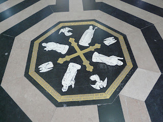
The floor of the Amiens Cathedral was planned out using the golden section.  They started at the center with the labyrinth and then radiated outward in a form the almost looks like the form of a nautilus sea shell.  The four figures represented in the labyrinth are thought to be the four bishops who oversaw the construction of the cathedral
Golden section with labels of steps added by me

Nautilus Sea Shell that I added lines to show golden section pattern on

Labyrinth

Even though this labyrinth is not a circle I feel that it does mark the most sacred spot within the cathedral.  I feel this way because of the importance of the labyrinth itself and because the entire layout of the cathedral started with this point and then radiated outward form this octagonal shape.

Tuesday, February 15, 2011

Dining Space Story


In 2015 the United Nations decided to mandate an International Memorial Day  that should be adopted by all nations.  By using social media every celebration should include guests from some other part of the world.  This biannual celebration is held on the days of the winter and summer solstice.  The global connections with other social medial participants will be established through a lottery system prior to the day of joint celebration.
This Sunday, June 21, 2015, my family and I will be sitting down to have a dinner with people from around the world thought the use of social media.  My three brothers, my parents, both sets of grandparents, and I will be sitting down to an early dinner and be able to share it with people from different countries around the world that have been chosen just like us through a lottery drawing that my mom got us into at the beginning of this year and we were the family selected for the United States.  We will be using several different interactive screens to view the other families through a live video chat.  Before hand we swapped recipes with the people from other cultures so that each family would have a taste of the other persons life for a few hours.  Then once the meal is cooked all ten of us will gather around the dining room table and turning on the video chat to view the other families sitting at their dining room table.  Then each family would explain their common traditions about dining in their culture and then we would all enjoy our meals at the same time while still being able to talk to the other families via the live video chat.  Then after the meal we can talk with them and discuss the food or anything else we want.  Later this year on December 21, 2015 we get to do this again.

Unit 1 Summary

Week 1: Looking inward and outward, humans materially encounter the cosmos + construct inhabitable signs + symbols as objects, spaces, buildings + places.

Week 2: circles, groves + stacks stand as humanity’s first elements + principles of design throughout a world populated by diverse human expression.

Week 3: the buildings atop the Athens acropolis serve as archetypes for all western architecture + design; elsewhere, humans expand groves + stacks.

Week 4: diverse building types abound in the west. Empires stand tall throughout the world. Trade routes bring people, goods + ideas into proximity.

During the first week of this class we talked about the idea of scales within and beyond human beings and Stonehenge and Giza and what they both represent.  On the first day of class we discussed Jules David Prown’s model “Mind in Matter”.  In this model Prown says that an artifact corresponds to patterns in the mind of the perceiver and can be assessed through a three-step process:
Description: a physical inventory, a content analysis, and an analysis of form.
Deduction: the links between material and perceiver’s world through sensory engagement, intellectual engagement, and emotional response.
Speculation: creative imagining in the eyes of the perceiver through hypothesis.
On the second day of class we discussed the possible meanings and significance behind Stonehenge and the Pyramids at Giza in Egypt.  We talked about how the circular form at Stonehenge was symbolic because circles symbolize equality, sacred spots, or important objects.  Then when we discussed the Pyramids at Giza we talked about how it is one of the oldest cities and they left documentation of their civilization through images.  Each side of the pyramid pointed in a different cardinal direction; North, South, East, and West.  Then the tip of the pyramid pointed straight up at the sun.  The pyramids also show hierarchy by the slaves being represented at the base because they were the majority and the base is the biggest part of the pyramid.  Then the center was the rest of society and the very tip is Rah the sun god that the Egyptians worshiped.


Image from: http://www.planetware.com/picture/pyramids-of-giza-egy-gzgrtpy.htm


During the second week of class we went over how circles, groups, and stacks are used in architecture from the past and then we connected it to architecture from today around UNCG campus.  We covered the four elements of circles, groups, stacks, and people.  When they were building early forms of architecture they were trying to model the things that they saw around them.  The circles were used to represent the sun and the moon or for marking sacred spots.  I have also noticed how often they mark important objects or moments as well.  The groups represented groves of trees or groups of people.  Stacks were used to represent mountains and gathering common resources.  People were used in architecture to imitate or imply the human body or things that look like humans.  When we went on our tour around campus I realized that these elements are used all over campus there are columns on the front of the buildings that represent groups, domes and circles to represent the circle element, and stacks are represented through the buildings that show the break in the levels on each floor.  However, in the walk around campus I was not able to find anything that represented the people element.

In the third week of classes we found historical architecture that used one or more of these four elements. 
For the third week we talked about how temples and palaces contain both groves and stacks together.  Then we moved on to talk about order and proportion in architecture and how the Ancient Greek culture tried to make the real seem ideal.  We also discussed the different types of columns.  The Greek columns included the Doric, Ionic, and the Corinthian and the Roman columns included the Tuscan and the Composite.  After we covered the types of columns we moved on to talk about the progression of the layouts of the Greek temples and then to talking about the Acropolis and the temples within it.  After going over the Acropolis we moved on to talk about the Xianyang palace and then compared and contrasted the two and how they use the four element and the principles of design. 
Image from: http://builderbug.com/modules.php?name=Encyclopedia&op=content&tid=12
Then in the forth week in class we moved from the ancient Greek world to the Roman Empire.  First we learned about the three conditions that good architecture follows.
         “The end is to build well.  Well building hath three conditions: firmness, commodity, and delight.”
-       Sir Henry Wotton (1568-1639)
The Element of Architecture, 1624

Wotton borrowed these three elements from Vitruvius’s idea of the three conditions.
         Utilitas: useful arrangement, quality, and interrelationship of spaces
         Firmness: performance: stability, integration, and safety
         Venustas: ability to create a sense of place and a positive effect
-       Vitruvius (ca. 80 BC – ca. 15 BC)
-       De Architectura (Ten Books of Architecture)

We then applied these ideas to Roman architecture.  We talked about how a circle and a cross are both very important and when one is laid on top of the other the center of the cross at the center of the circle is a very symbolic or sacred place.  We also talked about the aqua ducts, basilicas, arches, columns, coliseum, the pantheon, and their symbolic meanings.  We also talked about the significance of having things on axis and how axis’s help to lead you through a space or divide a space.
Image from: http://cms.fhsdschoolse.org/lisasmith/Rome/tabid/22043/Default.aspx

Sunday, February 13, 2011

Blog Post 5: Design & Music

For this assignment we had to select and image from Flickr and use it to address the connections between design and music when it comes to objects, spaces, buildings, and places.
Then using this image and a list of vocabulary terms that we were provided with we had to create a poem that includes at least three of the words on that list.  The poem had to be a couplet, free verse, haiku, limerick, or quatrain.  The poem and the image had to be able to match each other.


Continually spiraling downward, upward order
Linked together, hanging in perfect harmony together
Repeating over and over again


Reading Response 5

Tuesday, February 8, 2011

Theory Reading #2 - Babette's Feast

I think that culture can effect design because the culture of the people using the space can effect the way the space is used and what it is used for, which will in turn effect the design of the space.  For example, in Babette’s feast the two sisters grew up and have always lived in a small isolated village with their father who was the pastor of their small Protestant church.  The two sisters are very loyal to their religion and even though they are given opportunities to leave they choose to be loyal to their father and their religion and stay in the village.  Then when Babette moves in with them she decides to cook a feast for their celebration in their father’s memory.  The sisters however start to get nervous about what Babette will cook because she is a Catholic foreigner and so they ask for God to help them to get through the meal.  Over all of the years that the sisters ate in the dining room with their father the space never changed.  There were no candles, no tablecloth, or any other type of decoration on the table and the dishes that were used were very plain.  However, when Babette prepared her magnificent feast she put out a tablecloth that she then ironed to make it look perfect.  Then she put out candelabras with really tall candles that started burning above the people seated at the tables’ heads and slowly melted down.  The taller candles helped to illuminate the table alone and make all of the space outside of the tabletop shrink into the shadows.  So I think that the culture of the people who will be using the space effects how it is used.  When the conservative Protestants were using it they kept the area very simple with no decorations whereas when Babette decorated for her feast she put out decorations that would accentuate the space on the tabletop for the feast.

Babette's Feast

Sunday, February 6, 2011

Blog Post 4: Commodity, Firmness, and Delight

"In architecture as in all other operative arts, the end must direct the operation.  The end is to build well.  Well-building hath three conditions: Commoditie, Firmness, and Delight.
- Sir Henry Wotten, The Elements of Architecture, 1624

In the past week we have been looking at how commodity, firmness, and delight are accomplished in design.  We then looked at how these three principles related to both architecture in the Roman Empire and today, here on UNCG campus.  These three principles originated from the words utlitas, firmitas, and venustas.
Utlitas: useful arrangement, quality, and interpersonalship of spaces
Firmitas: performance, stability, integration, and safety
Venustas: ability to create a sense of place, a positive effect.


Front Entrance to MHRA

The building on campus that I think shows these three elements the best is the Moore Humanities and Research Administration building (MHRA).  I think that this building fulfills commodity, firmness, and delight.  The front entrance of the building is a circular form made of glass and steal with a concrete shell on the outside of it with double five sets of double doric columns for support.  The materials that make up the front entrance to this building are glass, steel/metal, tile, stone, and concrete.  As for the space just inside of the entrance there is a circle and when someone is standing in the center of that circle or on axis the ambience is much better than it is if you move off center/axis in that circle.  Radiating out from this circle are different colored tiles imbedded inside the larger white tiles that keep you on axis as you move into the space and as they get further into the space they get further apart.  Theres places on the floor are also mimicked through the lighted squares in the ceiling that also carry your eye on axis through the space.  Another thing that leads you through the space is the glass walls that are at the front, in the front office space, and at the back entrance that lead you eye from the front of the space to the back of the space.  The use of the two different colors of tile help to separate the areas where there are classrooms and the areas where the administrative offices are because the stone on the side where the offices are is tan whereas the stone on the classroom side is dark grey.  

View from Front Entrance
Administrative Offices

The frosted glass on the front entrance into the office space serves as a somewhat translucent barrier between the entrance to the building and the lobby of the offices without completely closing them off from one another.  
View of Front Area of Administration Offices

There are several layers of columns at the front entrance to this building.  First there are the cement doric columns at the very front of the building.  Then there are the plain cement columns right up against the glass and steel beams in between the glass that are directly behind them mimicking their form.  Plus, there are even hollow fatter columns on the inside of the building imitating all of the exterior columns.  

When it comes to circles and their corresponding 3D forms as marking sacred spots I think that the circle used in this building does mark a sacred spot.  Aside from it being the entrance into the building it is also the central point between the classroom section of the building and the administrative offices side of the building.  This circle also marks the beginning of the axis expressed in this building with the small colored tiles radiating out from it and leading you into the building.  Not to mention if you stand in the central circle that those small tiles create then your voice carries much better than if you are standing off axis or even on axis but not in that center spot because of the ambience effect of the building.  So for those reasons I do think that the circle in this building marks a sacred spot within this building.

Color Week


All color week assignments 

Color Week Assignment 1: Combination of two colors

Color Week Assignment 2: Combination of two colors

Color Week Assignment 3: Combination of four colors with one color

Color Week Assignment 4: Combination of three colors

Color Week Assignment 5: Color Palate

Color Week Assignment 6: Using colors from color palate abstractly represent the four seasons of the year (spring, summer, fall, winter)

Thursday, February 3, 2011

My Design Manifesto


A manifest is defined as a public declaration of policy and aims.  Living in a country with freedom of speech our manifesto can be about anything such as what we believe, what we value, how we feel about certain things, what we think, and how we choose to live.  All of these things shape the world around us as well as shaping us along the way.  Design is all about learning as you go and shaping the way you see and perceive things in the world around you and how you interpret that in return.  I know in my personal experience since coming into the interior architecture program my view of the world around me has changed a lot just over the course of a little over a semester and I know that it will continue to change as I learn more and I cannot wait!  I think design is really exciting, scary, challenging, and empowering all rolled into to one and I cannot imagine doing anything else.  Before you can succeed in design you have to fail.  As Tommy and Stole told us in the first couple of days in class “you have to learn how to fail before you can learn to succeed.”  It was quite a challenge failing and then having to learn to move on from that failure and turn it into a success.  I’ve come to view design as an adventure, you may come across some bumps in the road or get lost a few times but you get to have a blast along the way as well.  I approach studio in the same way because some days are really challenging and it would be easy to just throw in the towel and give up but I think the fight is worth it and I can’t wait to see where this adventure leads.

“Our job is to give the client…not what he wants, but what he never dreamed he wanted; and when he gets it, he recognizes it as something he wanted all the time.”
-Denys Lasdon quote from Designerly Ways of Knowing