
Wednesday, November 30, 2011
Monday, November 14, 2011


Thursday, November 10, 2011


Monday, October 31, 2011
Vegetable Fun
Today in class in honor of the fact that it is Halloween we brought in vegetables and had to create something with them by carving and piecing them together. Below are images of some of the final creations.


Thursday, October 20, 2011
GHM Model #3
For our presentation yesterday, Wednesday 10/19, John and I were responsible for constructing most of the model. We created the cut out for the back hallway, the alcove for the auditorium, the hallway, the 2nd floor balcony, the front desk, the modular seating, and of course a scale figure to go with the desk. Gluing down all of these curved walls was really interesting but I would have to say that gluing together the modular seating was the most interesting of all with its curves. I think the model turned out really well and in building it I got to use some of the same model building skills that I am learning in my Design Visualization I class. Below I have added some images of how the model turned out and some of the experiences it helps to understand.


Thursday, October 13, 2011
Blog That Assignment 4
Elements of Design: line, color, shape, texture, form, space
The elements of design that most relate to the work we are doing at the GHM are line, color, shape, texture, and space
Principles of Design: rhythm, emphasis, balance, unity, and proportion
The elements of design that most relate to the work we are doing at the GHM are line, color, shape, texture, and space
- line - curves in walls throughout lobby and museum
- color - new refreshing and exciting colors
- shape - curves rather than hard corners
- texture - durable materials to add texture and help with acoustics of the space
- space - using the size of the space and the height of the ceiling to an advantage to connect all three floors of the lobby space
Principles of Design: rhythm, emphasis, balance, unity, and proportion
The principles of design that most relate to the work we are doing at the GHM are rhythm, emphasis, unity, and proportion.
- rhythm - the history and curves resenating within the space
- emphasis - using pops of bright colors for way finding
- unity - connecting the museum with the outside community in the lobby space
- proportion - altering the size of regular objects to work with the height of the space
Pinecone Lamp
I found this interesting pinecone lamp light fixture on tumblr.com while I was browsing the interiors posts. I think that it is an interesting twist to a pendant light and I appreciate the semitransparent pieces of wood that are used. The wood panels create a nice contrast when the light is turned on because they come out really dark and then the light glows around their edges. However, when the light is turned off you can see the texture and grain in the wood so combined with its unique shape the fixture is interesting to look at both when it is turned on and when it is turned off.
 Source: http://style-files.com/2011/09/12/pinecone-lamp/?utm_source=feedburner&utm_medium=feed&utm_campaign=Feed:%20style-files%20(style-files.com)

Photoshop Rendering

Monday, October 3, 2011
Ceramic Tile and Carpet Ratings
The two most popular floorings for the GHM lobby are ceramic tile and wood so on Friday I chose the task of looking up the durability ratings for both of these types of flooring and this is what I came up with. For ceramic tile the rating system was developed by the Porcelain Enamel Institute (PEI) to rate a tile types durability to varying amounts of foot traffic. This scale ranges from 1 for the least durable to 5 being the most durable.
Sources of information:
- PEI Class 1 Rating (No foot traffic)
- recommended for wall use in residential and commercial applications
- PEI Class 2 Rating (Light traffic)
- recommended for walls and bathroom floors
- PEI Class 3 Rating (Light to moderate traffic)
- recommended for countertops, walls, and floors where normal foot traffic is expected
- PEI Class 4 Rating (Moderate to heavy traffic)
- recommended for all residential uses, some commercial, and light institutional
- PEI Class 5 Rating (Heavy to extra heavy traffic)
- recommended for all residential, heavy commercial, and institutional uses
Most of the ceramic tile produced today is a 5 rating on this scale however this scale does not take into account wearing from things other than foot traffic such as dirt and other damaging elements.
Carpet performance ratings, like ceramic tile ratings, are used to help select the best carpet for areas with varying amounts of traffic. They also do not take into account soiling, poor maintenance, or other damages. This scale is from 1 being the least durable to 5 being the most durable. However, not all manufacturers provide a performance rating but the ones that do it is found on the carpet label. Usually woven pile carpets are more durable than tuffed carpets
- 4 or 5 will maintain its new appearance longer
- 4 is considered outstandingly durable and is recommended for heavy traffic areas
- 2.5 - 4 is considered normal in terms of durability and will last long if it is properly maintained
- 2.5 - 0 should be used in the lowest possible traffic areas
Sources of information:
http://www.carpet-rug.org/residential-customers/selecting-the-right-carpet-or-rug/quality-and-performance/carpet-performance-rating.cfm
http://www.servicemagic.com/article.show.Ceramic-Tile-Grades.10844.html
http://www.floorbiz.com/tile/rating-ceramic-tile.htm
O'Henry Hotel and Greensboro
 |
| O'Henry Hotel |
On Friday each member of our group chose a historically important thing about Greensboro, from the list that the GHM committee gave us on Wednesday, to research over the weekend and mine was the O'Henry Hotel. The ideas for this hotel were thought of by Dennis and Nancy King Quaintance because they wanted to translate the great things about Greensboro into a hotel for the people of Greensboro. The hotel was built in 1919 but because of its timeless design it looks like it could have been built in 1998 instead. They wanted to design a hotel that blended tradition and innovation all into the same space. They named the hotel O'Henry after the world famous short story writer, William Sidney Porter, who was born in Greensboro in 1862. Some of his work includes "The Gift of the Magi", "The Last Leaf", "Of Cabbages and Kings", and "The Ransom of Red Chief". As a boy he attended his Aunt Lina's school house in Greensboro and his aunt's school house is the one that is displayed in the Gate City exhibit at the Greensboro Historical Museum. They also named the largest banquet hotel the "Caldwell Room" after David Caldwell who was another important figure of Greensboro. The couple used other buildings around Greensboro for different bits of inspiration such as the Aycock school. When they started thinking about having a restaurant in the hotel they decided that it would be better to build a restaurant beside the hotel rather than inside it so the restaurant could have its own identity. They named this restaurant the Green Valley Grill and designed it with a tuscan style and borrowed ideas from the Blandwood Mansion and a little pump house on Benjamin Parkway at Lake Daniel. Below are images of some of the interiors of the O'Henry Hotel. How Dennis and Nancy King Quaintance designed this hotel is really interesting and I think they succeeded as far as making this hotel what they had dreamed.
 |
| Common Room |
 |
| Courtyard |
Information Source: http://www.ohenryhotel.com/community.htm
Thursday, September 29, 2011
GHM Presentation #2 - Conceptual Ideas
On Wednesday we had our second presentation/meeting with the GHM committee and we presented our conceptual ideas that we have been working on since the last time we met with them. Paige and I presented the Old and New board, which had a combination of ideas on it. It had a neutral color scheme with the addition of red for an accent color, my proposed desk and kiosk idea, an extra kiosk idea by Alex, then the circulation chart and perspective. They really seemed to like the ideas that we presented them with and they had a lot of helpful feedback. Here is some of their overall main comments:
- like the desk idea, its contemporary design, and how it reflects the curvature of the space
- having more than one kiosk but not so many it is overwhelming
- would the desk be able to accommodate for two people sitting behind it
- make a timeless design because these ideas may not be implemented for several years
- some said they liked Alex's kiosk idea and felt that it would draw people over to see what it is because of its abstract design whereas some felt it might not be inviting enough
- some of them said they liked the color scheme and how it can go with things such a moving exhibits and banners because of the neutral colors while others felt that the colors were not welcoming enough
- adding shelves for information pamphlets on bands of the desk
- felt that the wood idea related to our color scheme was a good idea
- wireless kiosks so that wires don't interfere with the space
- like the mobility of everything
- liked how ideas reflected each other without being the same
- they liked the interactivity and entertainment of the kiosk
- want us to think of more multipurpose things
- they liked how the red stood out in the color scheme
- want us to play around with the idea of traditional vs. modern and twist the two together to create something unique
This meeting was really interesting and informative. I feel like we got a lot of great feedback from them during this meeting and we can take what they have given us in this meeting and move forward towards more refined ideas.
The process in which we presented the information went well, however I wish that we had more time to talk with each group, because we were getting a lot of great feedback and then every time the time limit seemed to cut it short. I think that it was helpful to have more than one person presenting each board because then if one of us forgot to mention an important aspect about our board then the other person usually remembered to bring it up and we could ping pong the presentation between each other so that we could share in the presentation work. I think overall the way that we presented the information to them went really well and I think we got a lot of useful information from them that we can work off of and have even more ideas for them in three weeks when we present to them again.
D.C. Presenation
During the class trip to Washington D.C. I was assigned to visit the National Museum of Natural Science, the National Museum of American Indian, and the American Art Museum and Portrait Gallery. The thing that I chose to focus my presentation on was the circulation through the lobby spaces and the museums as well as way finding and curiosity. I chose to focus on these aspects due to the fact that these are all areas in which the Greensboro Historical Museum needs improvement. I thought that the Natural History Museum was the most successful museum, because of the successful circulation and how it was designed to show you little windows into the exhibits to draw you into the spaces and experience the museum. There were signs for clear way finding and the space was very exciting and inviting. The circulation tough the lobby space of the Natural History Museum and into the exhibits made me think of a spiral, because you have to go out around the lobby in a circle to get to the exhibits and then you have to do the same thing on the second floor. The American Indian Museum also had a similar spiral formation in the lobby but I did not find the circulation in this building or in the American Art Museum to be as successful as the Natural History Museum.
I thought that the trip to D.C. and then the presentation tying together our current projects with some of the things we saw in D.C. was very useful. I did not take the time to really practice my speech so I feel that it I had the presentation could have been much better. I need to work on not using verbal fillers such as um and just pause to collect my thoughts instead. I have had a lot of speakers from the speaking center come in to several of my classes especially in my communications class I took last semester so most of the information that they covered I already knew but it was still helpful. I did not visit the speaking center before this presentation but I have been to the speaking center before. For the next presentation I intend to visit the speaking center to get helpful advise on my presentation and to practice more to improve my speech.
 |
Original Presentation Slide
|
 |
Edited Presentation Slide
|
Thursday, September 22, 2011

Photoshop Madness
For this assignment I had to choose a picture or pictures that I took in Washington D.C. and then alter them in photoshop. I chose to use two of the pictures that I took in D.C., one of the Capitol Building and one of a metal tree sculpture in the National Gallery of Art Sculpture Garden. I wanted to combine the two images so first I took away the sky in the photo of the Capitol Building to replace it with the sculpture tree. I then cropped out the extra stuff in the background of the tree photo and then flipped the image so that it looked more like lightening strikes rather than a tree. Then I combined the two images by putting the tree photo in a layer overtop of the Capitol Building background. Then I started messing around with the contrast, exposure, and brightness to see which looks I liked the most. I also played around with the alterations to change the appearance of the photos and the paint bucket to change the colors. I ended up really liking a lot of the photos that I produced so I continued to play around with it to see what I could do with it. I liked them so much I put most of them up on here because I couldn't chose just one image of my creations.
 |
| Original Photo of Capitol Building |
 |
| Original Photo of Tree Sculpture |
 |
| Capitol w/o Sky |
 |
| Capitol Photo with Tree Sculpture |
 |
| Image 2 |
 |
| Image 3 |
 |
| Image 4 |
 |
| Image 5 |
 |
| Image 6 |
 |
| Image 7 |
 |
| Image 8 and possibly my favorite one |
Tuesday, September 20, 2011
Have you seen the light yet?

This is an photo of a staircase that I found online that I thought was really interesting. The photo was taken by Nils Eisfeld and the photo is titled "Enlightenment". I think the photo and the staircase itself are both very interesting. The photo captures the image of a lightbulb created by the staircase and the light entering the space at the top, which I'm guessing is one of the effects the designer of the staircase had planned. Whether it was planned or not thought it still creates a very interesting effect in a unique way.
Spinal Staircase

I found these images of this really interesting and unique staircase under the architecture tab while browsing tumblr.com. The staircase was designed by Philip Watts for a private client in Northampton. It is a sculptural staircase that is made of glass and timber. I think that it is a very interesting way to design a staircase and it makes it a functional work of art for a building.


Another staircase that Watts designed is the one shown in the images below that was designed to be a centerpiece staircase in a room more another client in France.

These images and images of other sculptural staircases designed by Philip Watt are available at http://www.philipwattsdesign.com/bespoke/staircase-northampton
Thursday, September 15, 2011
Meeting with GHM staff, volunteers, and people from the community
On Wednesday Sept. 14th we went over to the Greensboro Historical Museum to meet with some of the staff, volunteers, and other people from the community to talk about the lobby space and the museum. Before we headed over to the museum we had a discussion among our group about what kind of questions we needed to ask them to find out more about the museum and what they wanted to see changed about the space. Some of the questions that we came up with to ask the staff of the GHM were:
- What should stay in the lobby space and what can go?
- What are the other uses for the lobby space over the course of the week, month, or year?
- What sort of budget we are dealing with for this project and how that will effect the project?
- What image should be conveyed though the lobby space?
- How does/should the lobby space fit within the image for the museum as a whole?
- What is the current amount of storage space and does there need to be more/less?
Before we presented to them what we had noticed in the space we had each of them come up with at least three things about the lobby that they feel needs improving. The ideas that they came up with were:
- make it look more like a museum
- make sure all of the systems (lighting, signs, electrical, etc.) work together
- making a bridge from the parking lot to the museum to connect the two
- create a more warm, open, and inviting space
- make parking lots more attractive so people are drawn in
- use a way finding technique such as signs so people know where to go within the space
- update things within the space such as flooring, wall coverings, and furniture
- make welcoming feature the first thing you experience when you enter the space without changing the volume of the lobby space
- improving the acoustics of the space to help with the noise
- creating seating within the lobby that invites people to sit down within the space
- possible turning the space outside the lobby into an amphitheater
- making the space flexible for all of the different events that take place within it
- making an info kiosk in the space
- a way to control the natural light entering the space
- engaging space to make people want to go look at the rest of the museum
After we heard some of their ideas on the lobby space we presented some of the things that we have noticed and discussed about the space. I presented the information that we already knew about the GHM and some of the things we had already completed in the space. These things were looking around the space, taking measurements, drawing up elevations for walls and ceilings, exploring exhibits and discussing them, and then talked about about idea of improving the lobby space in terms of circulation, identity, and unity, which were the three most important things we found that needed improvement.
Then we talked within our groups at our table about the questions that we had come up with before the meeting. Their answers and ideas were:
- make the staircase grander so that it stands out like it should with its large size
- change wall coverings to something more interesting while still maintaining the integrity of the space
- putting in more modern furniture
- putting in different flooring rather than tile that is there now to help with sound
- strip away some of the traditional things to make the museum more interesting
- want us to come up with conceptual and logical ideas so that there will be a variation to pick from and maybe combined together to be used
- making a method of way finding in the space so people know where to go
- the space is used for: receptions, exhibits, luncheons for the city council, board meetings, and intermission space for shows in the auditorium
- the image they are trying to show is welcoming, museum atmosphere, public place, and show what is happening at the museum with banners
- want museum to embrace the history of Greensboro
- put featured artifacts on display in the lobby to encourage people to want to see more
- fix the slope outside the entrance because it can get slippery in the winter
- having slip resistant flooring so people don't fall and get hurt
- having advertisements for the museum around the city
The people in my group also gave us two other successful places to look at for ideas and inspiration. Those two places were the International Civil Rights Museum and the Metropolitan Museum in New York.
Meeting with these people was very helpful to see what is needed and get some good ideas. I am looking forward to working on this project.
Saturday, September 10, 2011
Blog Assignment 001 - Industries of the Blind

When we first walked over to the Industries of the Blind last Friday I was not quite sure what to think because from the outside the building is really bland and does not stand out at all. Then when we first walked in and all I saw was white wall I was still a little worried that this might not be a very interesting visit. However, after the visit I have realized these original impressions are not true at all. There is a cute little relaxation garden at the bottom of the front staircase that is really pretty but given what they want in their space this garden does not fit at all. I think instead of a garden it would be a lot better if there were some kind of display there to show some of the interesting products that the people working there have created.
 |
| Garden Area |
The second floor of the lobby space was still not very exciting with all of the simple white walls and I think would really improve with the addition of some colors. I like all of the windows in the conference room because it adds a lot of natural light to the space and gives the building a connection to the world outside.
 |
| 2nd Floor of Lobby |
 |
| 2nd Floor of Lobby |
I think that David Lopresti seemed like a great supervisor and he would be enjoyable to work for. I think that having him as a boss is one of the things that makes these people so happy to come to work everyday because it is a very free and enjoyable environment and he treats them all with kindness and respect.
 |
| David Lopresti |
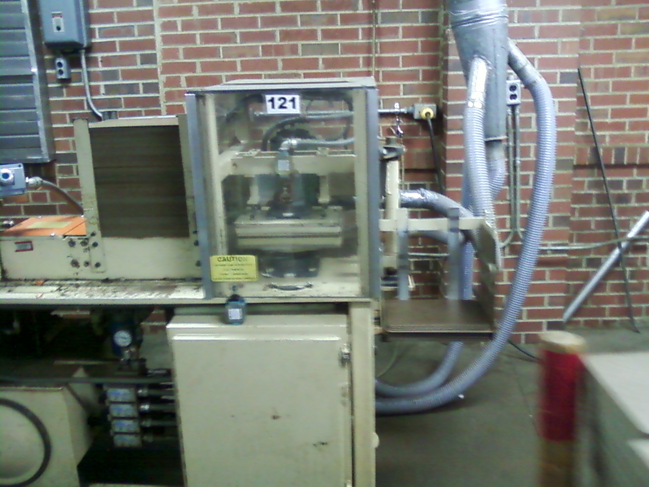
I think out of all the products they are making over at the Industries of the Blind the one that I find most interesting is the pen for the military that can be taken apart and used for some many different things if it is needed. Mr. Lopresti said that originally the building had windows into the factory space on the first floor but then they removed them because they did not want people to see what they were doing and I think that it would have been better to leave the windows in. If they had left the windows in then they might have sparked some interest in the people walking by, because they stuff they are doing in there is really interesting and now they have removed the windows but now they want them back for around that same reason. It is great how this company has given these people another chance at having a normal life; given them back their dignity, and how they are treated no differently from someone else so that they wont feel different. In this company you matter as a person not whether you are blind or not. The Industries of the Blind is a very open organization and it makes it fun to walk around and see what they are doing, all of the people are really friendly and nice to be around. Mr. Lopresti said that one thing they really strive for in this company is eliminating the idea that blindness is a disability. As I walked though the space I noticed that there is a lot of wasted space in some areas, which seems like it could pose a problem with people who cannot see because there is nothing for them to go by to get through the space. Even being able to see I still was not really sure of the correct path though the factory space.
 |
| Factory Space |
It was really fascinating to see them making all of their products, shirts, harnesses, pens, pants, and neck pads and seeing how efficiently and precisely they complete all of their work.
 |
| Shirt and Harness designed for the Military |
 |
| Pants |
 |
| Pen making process |
 |
| Clipboard Machine |
 |
| Shirt making stations |
 |
| Protective neck gear for Military use |
I think overall the spaces could all really use more windows to give the space itself a little more pleasant feel so that the space with match the people working there. I also think that if the interior of the ceiling with all of the wires, pipes, etc. was covered up that it would not be as distracting because I think that all of that stuff showing took away from some of the other stuff and made it seem too industrial. I really enjoyed touring the Industries of the Blind and meeting some of the extraordinary people that work there.
Even more pictures:


Subscribe to:
Posts (Atom)