Sunday, March 27, 2011

Reading Response 10: 3/28/11

Revolution to Pollution
When the industrial revolution began there we so many factories and such poor working conditions and yet people were so busy going about their own business that they hardly even noticed and the ones that did notice did not seem to care.  The pollution all of these factories were creating was beginning to have global affects in the 19th century.  There were towns such as Manchester, Leeds in England that were filled with basically nothing but factories.  Cities like Manchester were lacking several of that aspects that were common to cities in England in the past such as the city having no:

  • large streets
  • parks
  • churches
  • palaces
  • cultural institutions
  • elegance

Factory based cities like these created and took on a life all their own.  Despite these cities lack of common aspects of cities in England their populations were so high that they were competing in size with grander cities like London and Paris.  Manchester became the second largest city in England behind London.  These industrial cities also lacked any kind of urban planning.  For example, there was no sewages system and even something as simple as water delivery, which is highly important in every city was difficult due to the lack of planning.  Due to all the filth in the city outbreaks of typhoid and tuberculosis were very common.  The cities were severely polluted by:

  • factories
  • sewage
  • waste from slaughter houses
  • other debris
Factory Pollution
The pollution was so bad that the Thames River, which runs through Manchester to London smelled so horrible that work in the Parliament building beside the river in London was usually impossible.  Life in these industrial cities was horrible and the people in them usually did not live very long due to the pollution and dreadful living conditions.  The average life expectancy for people living in these cities was 28 years old. 
Painting of Manchester skyline
Industrial city of Manchester
A Change in the Wind
The problems these cities created were ignored until 1830 and things started to change.  The Great Reform Act of 1832 changed city districts to reflect changes in the pollution.  These changes included:
  • The Factory Acts of the 1830's which reduced the houses of child labor
  • The Mines Act of 1842 which prohibited all women and boys under the age of 10 from working underground
  • The Ten Hours Act of 1847 which limited the workday of women and small children to 10 hours
During the 1860's Joseph Bazalgette designed a series of underground sewerage pipes to move the waste downstream from the city.  Later water and electricity were added into this system.
Factory workers
Industrial Revolution and Architecture
The most important change in the architectural aspect was the creation of the factories themselves.  The ones that made the biggest impact however were the cotton and clothing factories, which had to be positioned near water and run off of waterwheels.  The structures were uniform in appearance and were usually rectangular blocks of undecorated brick or stone with wood flooring and were 4-6 floors tall.  The power of the waterwheel is distributed through the building through a system of shafts, gears, and belts.  This system was later improved with the invention of the wire rope around 1850.  The invention of electric machines also allowed the factories to be built in places other than along side rivers.  
Cotton factory powered by a waterwheel
Lowell, Massachusetts
The town was designed and built by the Merrimack Manufacturing Company.  They borrowed  British technology to create the first successful and completely mechanized cotton mill in the United States.  The plan for the town was very simple.  The  mills were arranged in a row along the canal with their backs to the Merrimack River and the housing for the workers was planned out in a rectangular fashion.  In the town there was a church, library, school, bank, and a mansion for the director of the factory.  Then the main street in town was lined with shops and public buildings.
Lowell, Massachusetts
In Conclusion
Through these changes the factories that we know of today were created.  Due to regulations the factories impact on the environment is controlled.  The advances of technology allow for continuing improvements in the design of the factories and their pollution control.

Images from Google Images
Information from Ching Textbook

Blog Post 10: 3/28/11

An object from the United States that I think carries messages of revolution much like the dollar bill is the U.S. postage stamps.  Unlike the dollar bill, which has stayed consistently the same throughout history since it was first created the postage stamps have changed to represent our changing history.  The stamps have shown images of many different things such as:

  • presidents and other important figures
  • important landmarks 
  • new inventions
  • important events
  • important sayings and quotes
  • other things that represent the U.S. as a country and its history
Past U.S. Stamps


Todays U.S. Postage Stamp


I think that these objects are revolutionary because they show our changing history and everything that that includes whether its changing presidents, advancements in technology, important milestones, or things that represent us as a nation.

Images from Google Images

Sunday, March 20, 2011

Blog Post 9: 3/21/11

Colonial expansion TO the United States:
One thing that carried over from Europe to the United States during colonial expansion is the large buildings with columns adorning the front entrance topped with a dome and external sculptures on the structure. The original structure in Europe is represented through both the Basilica of the Invalides in Paris and the St. Paul's Cathedral in London.  The overall structural ideas for these buildings and buildings like there were then carried over to the colonies.  This same structure is seen today used in a lot of government buildings such as the Georgia State Capitol Building and the United States Capitol Building.
From Europe:
St. Paul's Cathedral

Basilica of the Invalides
To the United States:
Georgia State Capitol Building

United States Capitol Building

Colonial expansion FROM the United States:
One for of architecture in the United States that then spread to other parts of the world is the skyscrapers.  The first skyscraper was the Home Insurance Building in Chicago and it was one of the first of its kind because of the steel structure that was needed to create it.  However, nowadays these kinds of buildings have gotten much taller and can be found all over the world in all different forms.

Reading Response 9: 3/21/11

Architecture and language
There are several different buildings throughout architecture that speak the same language even if it may not be exactly the same. For example the Barriere de la Villette speaks the same language as the Pantheon.

Ways they are alike:
  • circular center structure
  • front porch with columns
  • oculous in the center of the buildings roof
Ways they are different:
  • the Pantheon only has one porch at the very front whereas the Barriere de la Villette has a porch on each side more like the Villa Rotonda with its four identical facades
  • the Barriere de la Villette although it has an oculous just like the Pantheon it does not have a dome in the center circular space like the Pantheon does
The Pantheon, Rome
Barriere de la Villette, Paris
Villa Rotonda, Vicenza
The Pantheon is a building that was designed in a way that keeps people on axis because there is only one way to enter the space and then there is a clear path shown to move in and around the space.  Whereas with the Barriere de la Villette and the Villa Rotonda do not have a specified entrance out of there four possible entrances and therefore it makes it difficult to remain on axis.  I would say that the Villa Rotonda and the Barriere de la Villette seem more like they could fit in with the Baroque style of architecture because they broke the rules of being on axis and while the Pantheon is a very clean and plain building and so is the Barriere de la Villette but the Villa Rotonda has more decoration then both of the other structures but still not as much as Baroque style architecture.  However, in different ways each of these buildings is unique and reflects a little bit of the time periods before it and the time period in which it was built.

"The old, Christian preindustrial, predemocratic way of life has progressively broken away around him so that he has come to stand in a place no human being have ever quite occupied."
-Vincent Scully, Modern Architecture, 1961

Images from Google Images and information from Roth textbook.

Thursday, March 17, 2011

A pattern language in a writer's retreat (Theory Reading #4)

Some of the patterns from the article A Pattern Language that I think would be important to integrate into my design proposal for the writer's retreat would be placing important rooms towards the south so they will get sufficient light, placing common rooms in the center of circulation in a chain of rooms with a looping circulation, having an entrance room, and most importantly organizing the spaces from public at the front of the house and private at the back of the house.  The entrance room is important in this space for when people come over for the readings, when students come for discussions, or for when colleagues come to collaborate over work they will have a place to enter the space.  The rooms where most of the work is done such as the kitchen, living room, study, and dining room should be positioned properly to receive sufficient amounts of natural lighting.  I think the most important pattern is the one of organizing the house from public to private as it goes from the front entrance to the back of the house.
The pattern for this should be:
  • entrance - front
  • public
  • semi-public
  • private - back
This way there is enough area for the person living there to have space to meet with people while still being able to maintain their privacy.  The rooms such as the bathroom and common room should be placed somewhere between the public space and the private space so that they can be easily accessed from both ends of the house.  I think that for the purpose of this space the most efficient way to organize there rooms would be with a chain of rooms that have a looping pattern of circulation so that instead of having corridors to connect the spaces the are connected by moving through the rooms and then having the private spaces at the back separate to ensure the person living theres' privacy.  All of these patterns are going to be important in the design of this house to make it as efficient as possible.

Monday, March 14, 2011

Dining Space Project


Perspective drawing of dining space showing light and shadow in the space

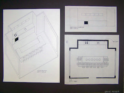
Axonometric, plan, and north wall elevation of dining space

Social interaction diagram, photos of stool, table/countertop and base materials,
and top, front, side views of sideboard

Top, front, side views of table

Final model (to scale)
Sketch model #2 redone with added detail
view of room facing north

Final model (to scale)
View looking through the west wall window

Final model (to scale)
view looking straight down on model

Final model
view of room looking north at a lower angle to show more
of the north wall detail and social media screens

Sketch model #2 (to scale)
view looking from west to east
after changes to the table
shows the entire space and ceiling skylight
but not entire ceiling

Sketch model #2
view of room from the south to the north

First sketch model (not to scale)
shows table and center section of the north wall
before I changed the design of the table

First sketch model 

First sketch model


Precedent Board/Parti #2

Reading Response 8: 3/14/11

The Baroque Era
Baroque architecture went against all the rules set for architecture during the renaissance.  The architecture created during this time period was considered "modern" architecture but not like the modern style that we usually think of today but to contrast it from all of the other architecture from around the time in which Baroque architecture was being built.  The architecture in this time period broke out of the renaissance norms and did everything that the renaissance architecture did.  Baroque architecture was complex, molded form, had plastic characteristics, and had a sculptural form to it.  Many people during the time thought that Baroque architecture was a disgrace and a scar in the history of architecture.  Cassiano dal Pozzo called it "the great disgrace of our age that, although it has before it such beautiful ideas and such perfect rules in venerable, old buildings, none the less it allows the whim of a few artists who wish to break away from antique to bring architecture back to barbarism."  Giovanni Pietro Bellori in referring to Baroque architecture said "everyone images in his head a new idea of architecture in his own manner..so that they deform buildings, broken and destroyed lines; they tear apart bases, capitals and columns with crowded stucco decoration and trivial ornaments and with faulty proportions, in spite of the fact the Vitruvius condemns such novelties."

Baroque architecture is:
  • an architecture of the senses
  • the detail and ornamentation has an emotional power over its viewers 
  • had an enormous jump in scale from renaissance architecture
  • sometimes the addition of so much detail and ornamentation made the proportions of the buildings seem distorted
  • worked to make materials look like a material other than what they really were
  • used extensive amounts of detail so that your eye would not know where to rest
  • more focused on spreading horizontally and controlling the landscape than going vertically to show the importance of the relationship between man and God as was done in earlier time periods such as the Gothic
I think that despite the attacks against the architecture of the Baroque time period I think they had a great influence in history and they the buildings still stand today as a beautiful representation of a part of history.

Objects, buildings, spaces, and places from the Baroque Era:

Château de Maisons near Paris
center space with the two side wings flanking 
it in a slightly smaller scale than the 
center portion of the building
steep mansard rooftop with decorative roofline

Apollo and Daphne sculpture - cappella cornaro
stone is carved to make it look like
soft folds of fabric 

Baldacchino
heavy decoration insures that the eye wont know
where to rest and therefore wont rest on any one surface
also makes materials seem like something
other than what they truly are

Chateau de Chambord
Several clear layers represent each floor but all three seem to be
crushed under the heavily decorated and elaborate rooftop

Baroque architecture from other parts of the world:

Schloss Nymphenburg (1675) in Munich

Castle Howard (1669) in North Yorkshire

Even in other parts of the world the Baroque period of architecture is still greatly influenced by spreading out and controlling the landscape to show power by seeing how far out you can spread rather than the previous ideas of showing power with verticality.  Large amounts of decoration and ornamentation are also used in other parts of the world in this time period.

Information and quotes from Roth textbook and pictures found on google images

Sunday, March 13, 2011

Blog Post 8: 3/14/11


There are several trends that have been carried throughout the ages such as the elements of using circles, groves, and stacks.  The idea of using a circle and a cross to mark a sacred place, with the sacred place being the center of the two, within a space.  Theres elements are also used in architecture today and there are examples of this around UNCG campus today.  Another design idea that has been passed on is the idea of having a courtyard in the center of the villa.  For example, it was first seen in the villas in Pompeii and other parts of Italy and then it was later used in the plazzo medici during the Renaissance in Italy.  The gothic and the baroque periods where the times when a lot of material, detail, and ornamentation were used.
I feel that overall the things that have been passed down the most and that are the most obvious are the use of the elements of circles, groves, and stacks.  Also the idea of having a circle and a cross together and the center of the two marking a sacred place.  I feel that these are elements that have been passed down through architecture and are still being passed down through the ages along with some other elements of architecture that have survived the test of time like the idea of having layers in a building such as the colosseum and the plazzo medici where you can distinctly see the separation of layers between the floors and see each floors significance.  
In conclusion I feel that a lot of architectural ideas have been passed down through time but as they were passed down they were also built upon to make them better or they were transformed into something almost entirely different from what they once were but the originals were the inspiration for the new creations.

Most prevalent ideas still present throughout architectural history:

the use of circles, groves, and stacks
the center of the circle with a cross in it marking a sacred place
the importance of commodity, firmness, and delight and architecture that strives to contain all three

Information from Roth and Ching textbooks and images from Google images

Value Study

For these value studies we had to create three groups of three value scales.  The first group of value scales had to be done in graphite and done by shading, hatching, and using random marks.  The second group had to be done in pen by using hatching, stippling, and random marks.  Then the third and final group of value scales had to be done in marker using stippling, hatching and shading.
Final Value Studies

The value study that I am the most proud of is my pen value studies because I think they turned out the best although the stippled value scale needs to transition better.  The pencil value study turned out okay but could still use some more work.  The marker ones also turned out okay although the shaded one bled into the paper a lot, which made it not look as good.

Material Value Study

For this assignment we had to select four materials from the IARC library, a wood, a tile, a textile, and a carpet, and create value studies using those materials.  We had to make two value scales for each material, one in pen and one in pencil.  One of the value scales had to be at full scale and the other one had to be zoomed out and we were able to decide which one we wanted to be in pen and which one we wanted to be in pencil.  

Final Value Studies
The value study that I am most proud of is my tile value studies because I think they transition the best and look the neatest.  The zoomed out value scale of the carpet was the hardest one for me because of the small loops in the carpet and making them all consistently the same size, which I found to be rather difficult.  However, overall I think these value studies turned out pretty well.

Wood Sample
Tile Sample
Textile Sample
Carpet Sample

Saturday, March 12, 2011

Social Media

For this project we were given the assignment to create a type of social media.  
Originally I though of making a type of table or desk for the home that could enhance social media.  However, the more I thought about it the more I liked the idea of having it used mainly in office space.  I think it would be more appropriate in an office setting because then you can easily communicate with other companies around the globe whereas in a home setting that is not a very common need. 

My social media is designed to be a table in an office space for meetings or conferences.  It has a touch screen glass surface in the center of the tabletop.  On this screen the people at the table can pass out, read, edit, and discuss documents without having to print it all off.  Everything can be viewed by everyone at the table simply by sliding it across the touch screen.
There is also a holographic projector that can project 3D video up from the screen so if you are having a video conference with someone in another country for example you can see them right there in front of you.

final model of social media


Parti of social media